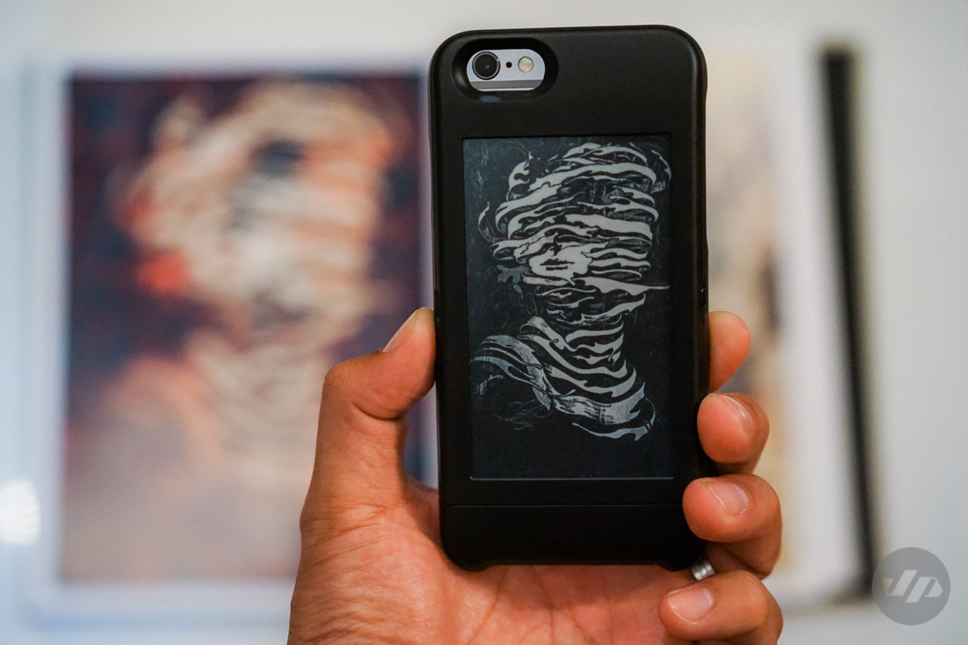
popSlate provides an option to finally customize the backside of your iPhone 6 with more than just stickers. A 4- inch E Ink (same technology that a Kindle uses) screen allows you to personalize your case with images. Photos, logos, screen grabs, and more can be showcased with pride.

The concept is quite simple, take a photo or select an image and utilizing the bluetooth chip inside the case you can beam the image to the screen. You can select up to 9 images at a time to swap between by pressing the small button on the side of the case.

Connecting with the bluetooth is very straightforward. I found this to be one of the key highlights with the ease of connectivity. The popCase app is a little bit of a different story. While it is easy enough to understand and use from creating a profile to taking photos and then “popping” them so they show up on your screen, I did run into some issues with some images not showing up on the case even after multiple attempts.

The social network feature I found to be a bit hit and miss. The functionality to access your Instagram account and “pop” selected images into your popCase was a nice touch. You can even follow other popSlate accounts or channels, but there aren’t many accounts to follow and everything is in black and white, which for me personally can get to be a bit dull although I do appreciate the typography and art channels. There’s also no option for interaction with others via the social network, which is key to creating and building a community. The only validation is given if someone “re-pops” your image.

The images themselves are converted to black and white for use on the screen. They aren’t the sharpest or most detailed and fair warning some photos look better black and white than others. The screen can be used for more than showcasing a photo or screen grab.

Images such as boarding passes and your Starbucks account can be used for practical purposes to avoid opening up each app or image on the phone and to save precious battery life. One thing that I would recommend if choosing to “pop” personal information or rewards memberships such as the Starbucks app is to make sure that you don’t have the “share new pops by default” selected otherwise your image will go out through the entire social network.


The case itself draws very little power and you can get up to a week’s worth of use with a single charge. So in the instance that your phone’s actual battery goes dead you can still flip through the various images.

Overall, the case is a great concept with a lot of potential and very unique to the market, but it’s still far from being something that I would use daily. If I am to use a case that adds a little extra bulk and functionality it will more than likely be a back-up battery case. I don’t doubt that the technology will improve and usefulness for a case such as this will prove to be a desired asset in the future – perhaps a way to read an e-book, get the news, show the time, or receive notifications, but for now at the price of about $130 it’s a bit hard to justify.

